Why Some Restaurant Menus Feel Easier to Read: The Hidden Role of Lighting and Visual Design in Dining Spaces
Research from Cornell University’s Food and Brand Lab has shown that restaurant environments influence how customers perceive food, make decisions, and even estimate meal quality. Lighting plays a major role in that experience. A menu that feels easy to read can quietly shape comfort, confidence, and ordering behavior without diners fully noticing why.
Many restaurants and cafes rely on illuminated menu boards, backlit food displays, and carefully designed visual surfaces to improve readability in busy environments. Materials such as Duratrans are often used in these settings because they allow images and text to remain visible under internal lighting. From coffee shops to quick-service restaurants, these display systems help maintain consistent visibility during breakfast rushes, evening service, and low-light dining hours.
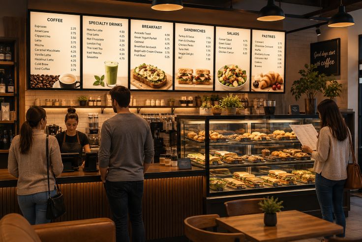
Menus Are Often Harder to Read Than Restaurants Realize
Many dining spaces unintentionally create visual obstacles. Dim lighting may look relaxing, but it can reduce contrast between text and background. Glossy menu surfaces sometimes reflect overhead lights, making prices or item descriptions difficult to see. Small fonts, decorative typography, and poor spacing can add even more frustration.
These issues become more noticeable in crowded restaurants where customers are expected to make quick decisions. Older diners may struggle with low contrast menus. Families ordering at a counter often experience pressure from long lines behind them. Tourists and first-time visitors may need extra time to understand unfamiliar menu layouts.
The National Restaurant Association notes that customer convenience increasingly affects dining satisfaction. While restaurants often focus on food quality and speed of service, environmental readability receives less attention despite its influence on customer comfort.
The problem becomes even more complicated when restaurants combine dark interior aesthetics with digital displays that are too bright or unevenly illuminated. Excessive brightness can strain the eyes just as much as insufficient lighting. Customers may glance away before fully reading menu details.
Why Lighting Changes Customer Behavior
Lighting affects the brain’s ability to process information. Studies referenced by the Illuminating Engineering Society suggest that visual clarity improves when text contrast and brightness levels are balanced properly. In restaurants, that balance helps customers navigate choices more efficiently.
Bright environments often encourage faster decision-making. Softer lighting may encourage customers to stay longer and order more leisurely meals. Fast-food chains and cafes typically use brighter menu areas to support quick service. Fine dining restaurants often reduce overall brightness but compensate with focused lighting directed toward tables or menu surfaces.
This difference explains why some menus feel effortless to scan while others seem tiring after only a few seconds. Good lighting design reduces mental strain. Customers spend less energy decoding text and more attention considering food choices.
Restaurant designers sometimes describe this as “visual pacing.” The environment guides how quickly customers move through the ordering process. Illuminated displays near counters can quietly organize customer flow during busy hours.
The Rise of Backlit Displays in Restaurants
Backlit displays have become increasingly common because they solve several visibility problems at once. Internal lighting distributes brightness evenly behind printed graphics, making text and food photography easier to distinguish from a distance.
Large coffee chains, cinema concession areas, and airport food courts frequently use illuminated menu systems because they remain readable under changing lighting conditions throughout the day. Morning sunlight, afternoon glare, and nighttime dimness affect traditional signage differently. Backlit displays provide more consistency.
These systems also support high-quality food imagery. Warm lighting behind translucent graphics can make beverages, pastries, and prepared meals appear sharper and more appealing without relying on excessive saturation or editing.
Materials used for these displays are designed to diffuse light evenly. This prevents hotspots or uneven brightness that could distract customers. Restaurants using illuminated graphics often prioritize durability as well since menu systems operate for long hours daily.
Environmental Observation: Why Cafes Often Feel Easier to Navigate
Independent cafes frequently succeed in menu readability because their spaces are designed around shorter customer interactions. Customers typically approach a central counter, glance upward, order quickly, and move aside.
As a result, cafes often use simplified menu structures, fewer font styles, and stronger lighting around ordering zones. Chalkboard-inspired aesthetics may appear casual, but successful cafes still rely on contrast, spacing, and directional lighting to keep information readable.
Many modern cafes also combine natural light with illuminated menu boards. During daytime hours, sunlight supports readability. In the evening, artificial lighting maintains visibility without forcing dramatic changes to the atmosphere. Discussions around electrical design in modern culinary spaces often highlight how layered lighting systems improve both customer comfort and operational efficiency inside restaurants and bars.
Some restaurants, by comparison, divide customer attention between decorative lighting, televisions, wall art, and crowded table layouts. When too many visual elements compete for attention, menus become harder to process.
The American Lighting Association emphasizes that layered lighting systems often improve comfort because they separate ambient lighting from task-oriented lighting. In restaurant design, task lighting includes the illumination used specifically for menus, ordering counters, and payment areas.
Digital Menus Introduce New Challenges
Digital menu boards solved some traditional readability issues, but they introduced new ones as well. Motion graphics, rotating advertisements, and rapidly changing screens can overwhelm customers instead of helping them.
Restaurants sometimes prioritize visual excitement over clarity. Animated transitions may delay ordering decisions because customers must wait for screens to cycle back to certain menu sections. Small text on widescreen displays can also become difficult to read from specific viewing angles.
Research published through The Nielsen Norman Group consistently shows that users process information more effectively when layouts remain predictable and uncluttered. The same principle applies inside dining spaces.
Some restaurants now balance digital convenience with static illuminated displays. Core menu items remain fixed and easy to locate, while promotional content rotates in smaller sections of the screen.
Designing for Comfort Instead of Visual Overload
The most effective restaurant environments rarely rely on a single design element. Instead, they combine lighting, typography, spacing, and material choices to reduce visual effort.
Readable menus usually share several characteristics:
- Clear contrast between text and background
- Consistent font sizes and spacing
- Balanced brightness without glare
- Logical grouping of menu categories
- Focused lighting around ordering zones
- Minimal visual clutter near menus
Restaurants that invest in these details often create smoother customer experiences without dramatically changing their branding or atmosphere.
Environmental psychology research from Harvard Business Review discussions on retail behavior suggests that customers respond positively to environments that reduce cognitive friction. In practical terms, people prefer spaces that feel easy to understand.
This helps explain why some restaurants immediately feel comfortable while others feel visually exhausting. Diners may not consciously analyze the lighting or display materials, but they still respond to the experience emotionally.
Conclusion
Menu readability is shaped by more than typography alone. Lighting conditions, display placement, visual balance, and illuminated signage systems all influence how customers interact with dining spaces. Restaurants that carefully manage these elements often create calmer, more efficient ordering experiences.
Backlit menu systems, translucent display graphics, and illuminated food presentations have become common tools because they help maintain visibility in changing environments. Whether used in cafes, quick-service chains, or modern dining spaces, these visual solutions support readability while blending into the overall atmosphere.
The best restaurant environments rarely draw attention to their design choices directly. Instead, they quietly remove obstacles. Customers read comfortably, make decisions with less stress, and move naturally through the space. Good lighting design succeeds when diners barely notice it at all.